Checkout Blocked: What 61% of Dutch Webshops Got Wrong
It is a Tuesday evening in Utrecht, and Sanne would like to buy a kettle.1 She is blind and uses a screen reader, software that reads the page aloud and lets her control it from the keyboard. She has done this thousands of times. She finds the big webshop, searches for "waterkoker", and moves through the results by heading, which is how most experienced screen reader users skim a page. So far, so ordinary.
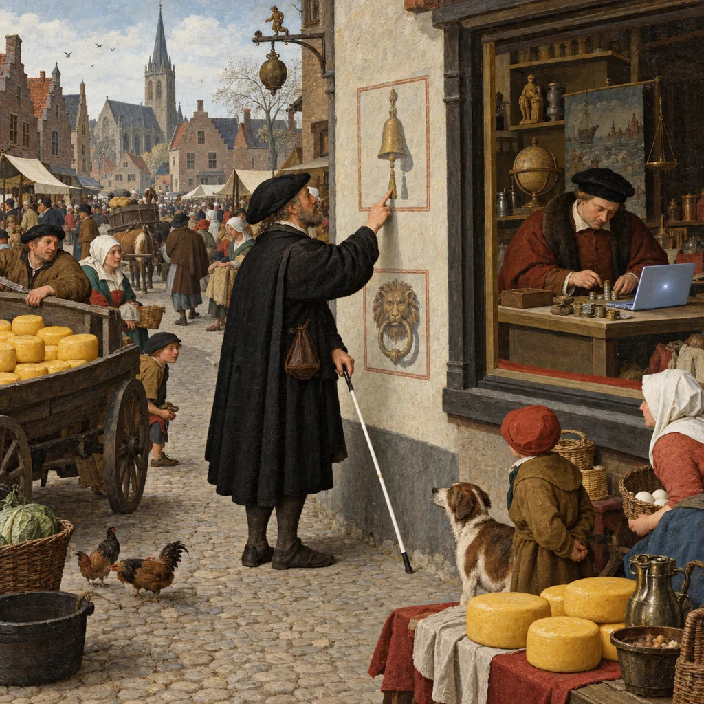
The product page goes well, too, until she presses "In winkelwagen". Nothing is said. Did it work? There is no way to know without leaving the page, so she presses it again, just to be sure. Somewhere in a warehouse in Tilburg, a second kettle is now reserved in her name.
At the checkout, the screen reader starts to sound like a very tired auctioneer: "Edit text. Edit text. Edit text. Clickable. Clickable." The fields have no names, so she guesses their order from the one she can hear, which is the postcode. Then she reaches the order button, which the screen reader calls "clickable" and nothing else. She presses Enter. Nothing. She presses Space, and the page scrolls down by one screen. She presses Enter eleven more times, with increasing feeling, and the focus slides into the footer, where the screen reader begins, slowly and with great care, to read the vacancies page. (The shop is hiring a front-end developer. Of course it is.)
So she tries to log in instead. The login page has a box that says "I'm not a robot". She ticks it, and a grid of nine pictures appears: select all the squares with bicycles. In the Netherlands, this is less a test than an insult. It is also a picture, and her screen reader cannot see pictures. The kettle stays in Tilburg, ordered twice and not at all.
Step away from the basket for a moment. Nothing about Sanne's evening needs new technology to fix. A button that is not a button, a field with no name, an announcement that never happens, and a puzzle made of pictures are some of the oldest faults on the web. The only new thing is that, since 28 June 2025, they are a legal problem in every EU country, and the Dutch regulator has now gone and counted them.
On 24 March 2026, the Autoriteit Consument & Markt (ACM), the Dutch consumer and competition regulator, published the results of its checks on about 100 of the largest Dutch webshops and the biggest telecom and energy sites. At 61% of them, it was impossible to place an order using assistive technology. Another 33% had "serious problems". Its examples were exactly Sanne's: an order button that cannot be clicked with the keyboard, and an inaccessible CAPTCHA. It is the first set of test results under the European Accessibility Act that I have seen a regulator publish.
So here is the plan. First, what the ACM found, what it did not say, and why an automated scan would never have found it. Then the order button, taken apart down to the event that fires when you press a key. Then the CAPTCHA, a bouncer that turns away the guests and waves the robots through. And finally a (made-up) Dutch e-commerce manager who tests her own checkout with a keyboard and a free screen reader, which you can copy tomorrow.
Let's get into it.
Part 1: What the ACM Actually Found
Under the Dutch law that brings in the European Accessibility Act (EAA), the ACM has supervised webshops and communications services since 28 June 2025. For this round it chose the largest companies with the most customers, and tested about 100 of the largest Dutch webshops, plus the websites of the largest telecom and energy providers. NL Times reports that it ran the tests alongside users with disabilities, and that people with visual impairments faced the greatest barriers.
The results, in the ACM's own words (my translation):
- At 61%, "it is impossible to place an order with assistive equipment". For example, "an order button that cannot be clicked with the keyboard", or "an inaccessible puzzle to check whether a user is a human ('Captcha check')", which means consumers cannot get into the website.
- A further 33% had "serious problems". Ordering is possible, "but takes considerably more effort, because the user cannot take in all the content of the website".2
Özlem Sehirli, the ACM's manager of consumer protection, put it plainly: "In our test results we still see many inaccessible webshops. As a result, people with a disability are shut out of something that is self-evident for many: shopping online. That can and must be better."
What the numbers do not say
Three things are missing, and it is worth being exact about them before anyone quotes this in a board meeting.
The ACM did not name the shops. It did not say what happened at the other 6%, so do not read that as "6% passed". And it has not fined anyone. It will point the worst-performing large companies to what they must fix, and those that "do not make sufficient improvements risk enforcement". Its spokesperson, Saskia Bierling, told NOS that companies will get "a reasonable period" to make changes, and that after that, sanctions follow: "for example a fine or a last onder dwangsom".3
So as of March 2026, this is a warning with numbers attached. Most talk about the EAA since June 2025 has been about scope and deadlines, which I went through in Accessible by Law. This is what it looks like when a regulator stops talking about scope and starts pressing Tab.
The rules apply to businesses with 10 or more staff and/or a turnover above €2 million. And the ACM's rules page is clear that you are responsible for accessibility even if you hire another company to build your website or app. "The agency built it" is not a defence.
What the shops said a year earlier
The ACM also published research it had commissioned from Motivaction, a Dutch research agency, on what webshops know and do about accessibility. The fieldwork ran from 13 to 30 May 2025, a month before the rules applied. Trade associations passed the questionnaire to their members; 108 people answered, and 63 of them were in scope (not microenterprises). Motivaction also ran 14 interviews. It is a small, self-selected sample, and the answers are what companies believed about their own sites, not what anyone tested.
That is exactly what makes it interesting. Asked whether "the webshop can be fully operated with only a keyboard", 13% said yes, 33% said partly, 24% said no, and 27% did not know.
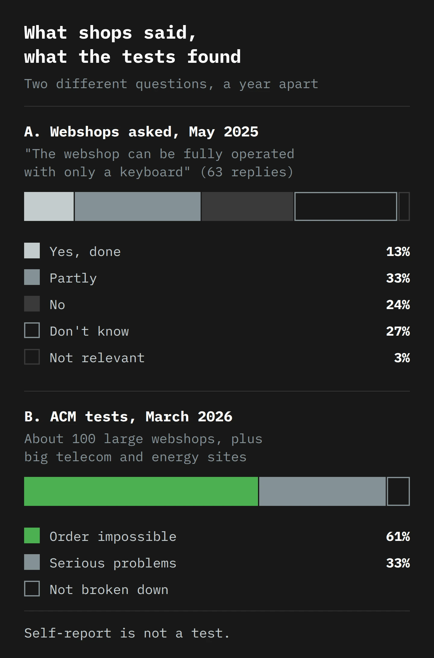
These are different questions about different companies, a year apart, so you cannot subtract one from the other. But in a survey where people describe their own work, only about one in eight claimed a fully keyboard-operable shop, and more than a quarter did not know. Motivaction found that companies went first for the "low-hanging fruit", such as colour and contrast, and put off the changes deeper in the code. Keyboard operation, it says, "is a difficult change for many organisations". And larger companies work in a calculated way, because accessibility costs money, "while the benefits and the risk of fines are estimated to be low". The companies surveyed also expected the ACM not to fine anyone straight away.
They were right about that, for now.
Why the Netherlands looks good on paper
Here is the part that surprised me. Each year, WebAIM, a non-profit at Utah State University, runs an automated checker over the home pages of the top million websites. In its 2026 report, with results from February 2026, 95.9% of home pages had detectable WCAG failures, at 56.1 errors per page. The Dutch .nl domain was one of the better ones: 45.5 errors per page, 18.9% fewer than average. (Shopping sites went the other way, at 71.0 errors, 26.6% worse than average.)
The real lesson is in WebAIM's methodology note, which almost nobody quotes: "Absence of detected errors does not indicate that a page is accessible or conformant." An automated checker reads one page as the browser renders it. It can see that an image has no alt attribute, or that grey text is too pale. It cannot put a kettle in a basket, fill in an address, reach a payment page and try to press a button that only responds to a mouse. The ACM's 61% lives almost entirely in the part of the site an automated scan of a home page never reaches.
WCAG makes this a rule. Its conformance requirement on complete processes says that when a page is one step in a process, "all web pages in the process conform at the specified level or better". A checkout is a process: if one step fails, the purchase fails. Erwann Robbe, legal coordinator at the French legal collective Intérêt à Agir, gave France 3 a better image: "declaring a site accessible because it has a 70% accessibility rate is the same as declaring a staircase accessible because 7 steps out of 10 are" (my translation).
In France, the road is different. Two disability associations, ApiDV and Droit Pluriel, sent formal notices to Auchan, Carrefour, E.Leclerc and Picard Surgelés in July 2025, and by 12 November had sued all four under the French Consumer Code, after a committee of visually impaired IT experts tested the grocers' sites. Hearings were listed for February and March 2026.4 I have not seen a judgment yet. In the Netherlands a regulator is testing; in France the customers tested and went to court. Either way, somebody outside your company is going to try your checkout without a mouse.
And the European law already names the parts that failed. Annex I of the European Accessibility Act requires e-commerce services to make "the functionality for identification, security and payment" perceivable, operable, understandable and robust. Login, CAPTCHA, payment: the three places Sanne got stuck fall under the three functions the law names.
Part 2: The Button That Isn't a Button
You are at a lift. There is a round brass button with an arrow on it. You press it, it lights up, and somewhere above you a motor starts. Now imagine a lift where the button is a sticker: perfect in every detail, down to the little shadow. You press it, and nothing happens, because a sticker is not wired to anything. Everybody waits for the stairs.
That is the order button the ACM gave as its first example, more or less. To see why, you need two ideas: what the keyboard can reach, and what happens when it gets there.
Focus: the one thing the keyboard is holding
On a page, one element at a time has keyboard focus: the keyboard's version of the mouse pointer, the thing that gets the next key you press. Tab moves focus to the next element that can take it, and Shift+Tab moves it back. The order it moves in is the tab order, and if you have ever tabbed from name to email to phone in a form, you have used it.
The ACM's guidance page gives its own minimum list of what a keyboard user must be able to do. It is short enough to quote in full (my translation). A user must at least be able to:
- scroll up and down with the arrow keys;
- jump to buttons, links and input fields with the Tab key (and back with Shift+Tab);
- open a button or link with Enter;
- make choices with the space bar, such as ticking radio buttons and checkboxes;
- move through the options in a list with the arrow keys.
That list comes from the ACM's page on real-world accessibility problems, and it is the regulator's own bar. The page adds that people with RSI, MS, ALS or Parkinson's often use a joystick, voice control or switch control, which often work through the keyboard. If your site works with the keyboard alone, it usually works with those too. WCAG's rule is 2.1.1 Keyboard: "All functionality of the content is operable through a keyboard interface".
How the browser decides what Tab can reach
The browser builds the tab order from the HTML, and puts certain elements in it automatically: links with an address, form fields, select lists and button elements, because those are things you interact with.
A div is not on that list. It is a plain box with no meaning, the HTML version of an unlabelled carton. Paint it green, round its corners and write "Place order" on it, and it looks exactly like a button. The browser still treats it as a carton, and Tab skips it.
<!-- A real button: in the tab order, works with Enter and Space -->
<button type="submit">Place order</button>

<!-- A sticker on the lift: mouse only -->
<div class="btn btn-primary" onclick="placeOrder()">Place order</div>
Both lines look identical on screen once the CSS is applied. The difference is only in what the browser knows.
The event that never fires
One level down is what happens when a key is pressed. Page scripts respond to events, small messages the browser sends when something happens, such as "the mouse was clicked here". The onclick above waits for a click event and then runs placeOrder().
For a real button element, the browser does you a favour. MDN, the web's standard developer reference, explains it: for a native button, the click event "fires for mouse clicks and when the user presses Space or Enter while the button has focus". The keyboard is turned into a click for free. The W3C's Authoring Practices say the same thing from the user's side: when a button has focus, Space activates it, and so does Enter.
For anything else, there is no favour. MDN again: "if another tag is used to create a button, the onclick event only fires when clicked by the mouse cursor, even if role="button" is used." So Sanne's order button did three things wrong at once. It was not in the tab order, so she only reached it by reading down the page with the arrow keys. It had no role, so her screen reader called it "clickable" (a hint that something listens for clicks) instead of "button". And when she pressed Enter or Space on it, no click event fired, so placeOrder() never ran. Space did what Space does on an ordinary page: it scrolled.
You can repair a div by hand. You add role="button" so the screen reader says "button", tabindex="0" so Tab can reach it, and a keyboard listener that runs the same code on Enter and Space, taking care not to scroll the page. That is three patches to rebuild, badly, what button does for free.5 WebAIM's scan found 4.8 role="button" attributes and 30.4 instances of tabindex="0" or tabindex="-1" per home page on average, which tells you how much of the web is rebuilding buttons. My rule is short: if it does something, it is a button. If it goes somewhere, it is a link. The rest is decoration.
Seeing where you are, and getting back out
Two more keyboard faults sit in the same family, and the ACM names both.
The first is focus you cannot see. WCAG 2.4.7 Focus Visible requires "a mode of operation where the keyboard focus indicator is visible". The ACM's guidance says the focus is sometimes "switched off", often with one line of CSS, which I covered in the first check of the EAA post. A sighted keyboard user with no focus ring is Sanne without the screen reader: the page is there, and they have no idea where they are on it.
The second is the keyboard trap. WCAG 2.1.2 No Keyboard Trap says that if focus can move into a component with the keyboard, it must be able to move out again. The ACM's example is a good one because it is so common: search fields that suggest words while you type. Focus goes into the suggestions and cannot come out, forwards or backwards, so the user cannot finish an order and has to leave the site. Its fix is simple: let people close menus, notices and pop-ups with the Escape key.
One trap is legitimate. A modal dialog, the kind that dims the page, keeps focus inside while it is open: in the Authoring Practices, Tab wraps round inside the dialog, and Escape closes it. The difference between a good modal and a trap is the way out.
The silence after "add to basket"
Now back to Sanne's first problem, the one that cost her a second kettle. She pressed "In winkelwagen", and the basket count in the header changed from 0 to 1. A sighted customer sees the number change. The screen reader said nothing, because nothing told it to.
The ACM lists this under the "robust" principle: something on the page changes, "but the user does not get to hear it", because the change is not passed to assistive technology. Its examples are adding a product to the basket, a basket that opens as a new panel on the same page, and error and confirmation messages after a form.
A screen reader does not read pixels. It reads the accessibility tree, a hidden version of the page in which each element has a role (button, link, text box) and a name ("Place order"), which I walked through in the EAA post. And it mostly speaks about the element that has focus. A number changing in the header, far from focus, is invisible to it.
WCAG has a criterion for exactly this, 4.1.3 Status Messages: status messages must be exposed "through role or properties such that they can be presented to the user by assistive technologies without receiving focus". The usual tool is a live region, a part of the page the screen reader watches and reads out when it changes. WAI-ARIA's status role is for advisory information that does not justify an alert, and it is "polite": the screen reader waits for a pause before it speaks.
<p role="status" class="visually-hidden" id="basket-status"></p>
<!-- After a successful add, the script sets the text: -->
<!-- "Kettle added to basket. Basket: 1 item." -->
One sentence, spoken at the right moment, is the difference between one kettle and two.
Forms that say what they want
The last keyboard-and-screen-reader fault on the ACM's list is the form itself. Its guidance describes fields with the label only inside the field, as placeholder text that disappears when you start typing, and labels that are "not properly linked to the fields", so "a screen reader does not say what should go in each field". It says this often happens on the pages where customers enter their details to order, and on the discount code field (the one field every shopper is guaranteed to try).
This is WCAG 4.1.2 Name, Role, Value again, and a <label> element linked to the field is the reliable fix. The ACM adds a less obvious one: forms that do not support the browser's autofill, so people with limited hand movement type their address in full every time. The fix is the autocomplete attribute with the right values (name, email, postal-code and so on), which is WCAG 1.3.5 Identify Input Purpose. It also makes checkout faster for everyone, which is the easiest business case in this post.
Part 3: Prove You Are Human (Terms and Conditions Apply)
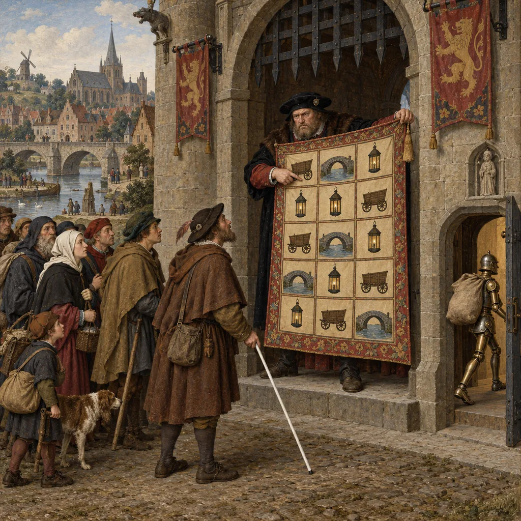
The second fault the ACM named is the one everybody has met. You are at the door of a popular bar. The bouncer does not check your ID. Instead, he hands you a blurred photograph and asks you to point to every square that contains a bus. You are not drunk; you just cannot tell whether a very small grey shape is a bus, a bin or a Dutch bicycle in a hurry. Behind you, somebody who has done this a thousand times points at the right squares in two seconds. He is, it later turns out, a robot.
What a CAPTCHA is, and who it stops
A CAPTCHA is a test that a website gives you to check you are a person and not a script.6 The classic version shows letters or words in a deliberately distorted image and asks you to type them. Newer versions ask you to pick pictures, solve a small puzzle, or tick a box.
The problem for people with disabilities is not a side effect. It is the design. The W3C's note on the inaccessibility of CAPTCHA puts it directly: "asking users who are blind, visually impaired or dyslexic to identify textual characters in a distorted graphic is asking them to perform a task they are intrinsically least able to accomplish." The audio versions are distorted too, on purpose, because speech recognition would otherwise solve them; the note quotes a test in which one was unintelligible to four test subjects, "all of whom had good hearing".
WCAG 1.1.1 Non-text Content has a special clause for CAPTCHA: describe its purpose in text, and offer "alternative forms of CAPTCHA using output modes for different types of sensory perception". In practice that means "picture plus audio", and we have just seen how well the audio works.
The ACM's guidance page adds two details. CAPTCHAs are often hard to use with the keyboard, and sometimes demand too much speed. And the problem "often occurs on a sign-up page", which means the user "cannot create an account and cannot place an order". A CAPTCHA at sign-up stops the sale before the basket exists.
Screen reader users have been saying this for a long time. WebAIM surveyed 1,539 screen reader users in December 2023 and January 2024, and asked them to rank the most problematic things on the web. CAPTCHA came first "by a notable margin", ahead of confusing menus and dialogs, links that do not make sense, and lack of keyboard access. WebAIM notes that the order of that list is "largely unchanged over the last 14 years".
The checkbox that is not a checkbox either
"But we do not use the blurry letters," you say. "We use the box that says I'm not a robot." Fair. This is where it gets interesting, and slightly uncomfortable for anybody who reads this blog for the privacy posts.
The W3C note gives the history of Google's reCAPTCHA v2, the "I'm not a robot" box. It points out that "the checkbox was, of course, never a checkbox in the traditional HTML sense". Behind it, the service collects signals to decide whether you are human, including, in the note's words, "all cookies placed by Google over the last 6 months", the browser's language, the clicks or touches on the screen, and the installed plugins. If that sounds like the browser fingerprinting I have written about, it should.
For a while, the note says, this made v2 fairly accessible, because it "was capable of being comfortably completed using a variety of assistive technologies". Then two things changed. It has been "widely observed that utilizing keyboard navigation, as many assistive technology users do, no longer works"; users are "presented with a traditional inaccessible CAPTCHA as a fall-back mechanism". Private browsing or blocked cookies can trigger the same fallback. And the audio alternative is sometimes withdrawn, and the user sees: "Your computer or network may be sending automated queries. To protect our users, we can't process your request right now."
Put that together and you get a neat, horrible loop. The box judges you partly on how you move and how long your cookie history is. Keyboard users and privacy-minded users are more likely to get the fallback puzzle, and the puzzle is the part a blind user cannot do. The box works best for the users who least needed it. (It is also a third-party script that collects data, so it belongs in the same consent conversation as your tags, which I covered in No Consent, No Conversions.)
Where the rules are going
WCAG 2.2, the current version (I read the edition dated 12 December 2024), adds 3.3.8 Accessible Authentication (Minimum): a "cognitive function test (such as remembering a password or solving a puzzle)" must not be required to log in, unless there is another method, a mechanism to help (such as password managers and paste), or the test is only to recognise objects or the user's own content. The W3C's explanation adds that a transcribed audio CAPTCHA does not count as the alternative, and that 3.3.8 covers logging in, not creating an account.
Mind the dates. The ACM's rules page, as of January 2026, says the legal standard is WCAG 2.1 at level AA, and that "in the course of 2026, WCAG 2.2 level AA will become the new standard". So today, a CAPTCHA that stops a keyboard user at sign-up already fails 2.1.1 Keyboard, and without an alternative form it fails 1.1.1 Non-text Content. Later this year, a puzzle at login with no alternative and no mechanism to help will fail 3.3.8 as well, unless it only asks the user to recognise objects or their own content.
What to use instead
The ACM's advice is refreshingly short: "It is better to avoid the use of Captchas" (my translation). If you must use one, provide an alternative, and make sure everyone can complete it.
The W3C note agrees, and adds a security argument for whoever installed the CAPTCHA: "using a CAPTCHA as a security solution is becoming increasingly ineffective", because image, logic and audio CAPTCHAs "can be largely cracked" by software, and the harder the distortion gets, the less humans can solve it either. The bouncer is stopping the guests and waving the robots through.
The options it describes include:
- A honeypot. A form field hidden with CSS, which only a bot fills in. The note says this is "easily implemented even in hand authored markup and should be considered." Hide it from screen readers and the tab order too, or you have built Sanne a new trap.
- Heuristics. Watch what the traffic does. The note mentions the volume of data requested, the pages visited, IP addresses and the way data is entered; in practice that means signs such as too many attempts from one place, or a form filled in a tenth of a second. (The signs of bot traffic in my GA4 post carry over.)
- A score, with a human-friendly fallback. Google's own reCAPTCHA v3 returns a score "without user friction" and, in Google's words, "will never interrupt your users". For a login with a low score, Google suggests requiring two-factor authentication or email verification. Neither is a puzzle. That fallback is the part to design carefully: an emailed link works for a screen reader user, and a picture grid does not. (A score service still loads a third-party script, so the consent question above still applies.)
Part 4: Femke Tests Her Own Checkout
Meet Femke. Femke is the e-commerce manager at a bicycle parts webshop in Rotterdam, with 40 staff.7 The day after the ACM's announcement, her director asked whether they are in the 61%. She does not know, and neither does their agency. So she clears a week and tests it herself. You can copy her week exactly.
If you have just pressed Tab on this page to see whether I practise what I preach, good. That is the correct instinct, and it is the whole of Monday.
Monday: the keyboard, and nothing else
Femke clicks once in the address bar and puts the mouse away. (On a Mac, keyboard access to all controls may need switching on first; the W3C's Easy Checks explain where.) Then she buys a set of brake pads, home page to confirmation, with only the keys on the ACM's list. At every step she asks the five questions Easy Checks gives: can she tab to everything, tab away from everything, follow a sensible order, always see the focus, and do everything without mouse hover? She writes down the first place each one fails, and what happened there.
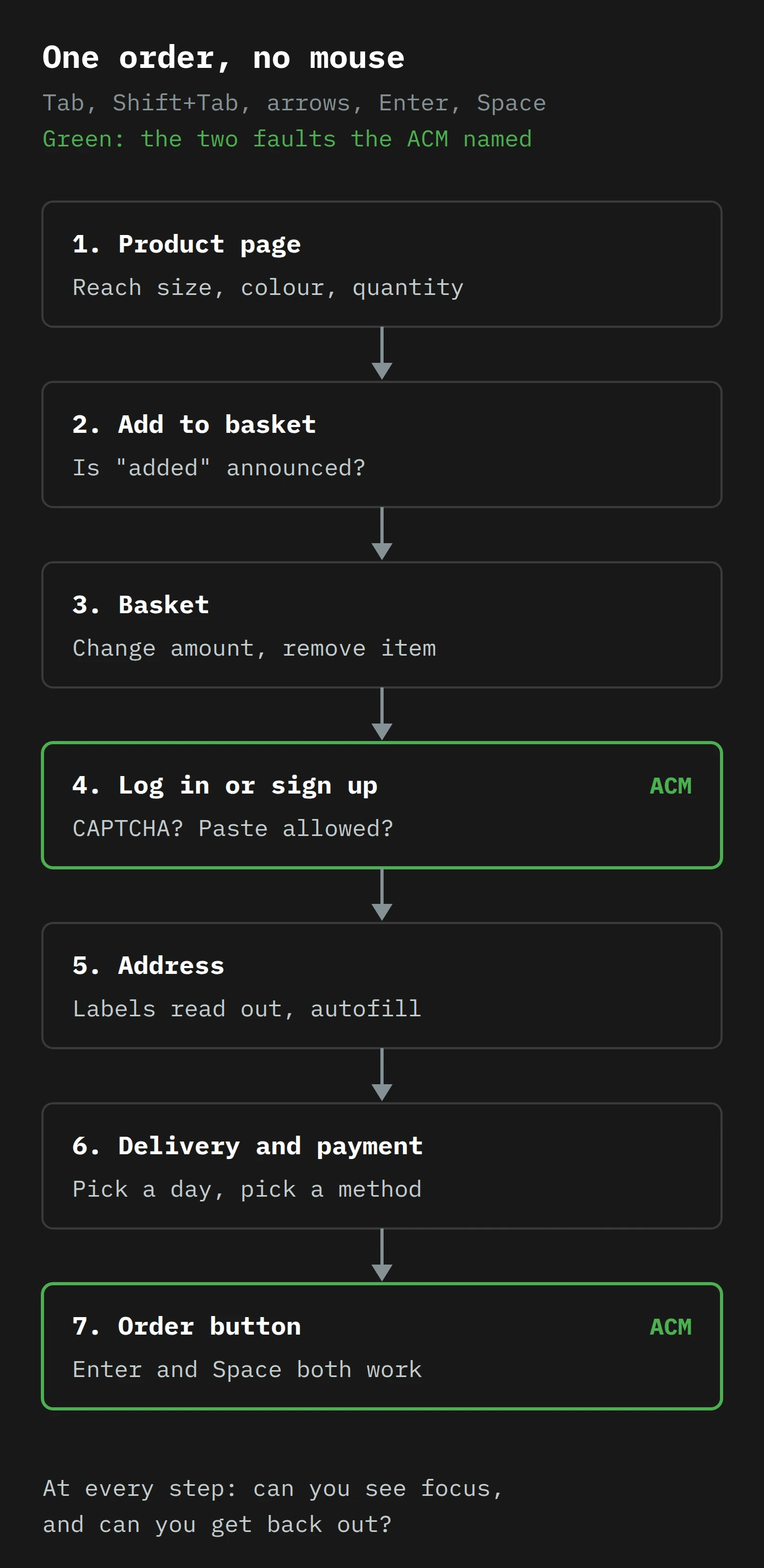
The product page mostly works, though the size selector opens on hover and never on Enter. The basket works. Then Tab goes straight past the calendar for choosing a delivery day, which is the ACM's own example of a failure that stops people choosing a payment method or delivery day. She cannot place the order. On Monday afternoon, her shop is in the 61%.
Tuesday: listen to it
On Tuesday she installs NVDA, a free screen reader for Windows, which is the main desktop screen reader for 37.7% of WebAIM's survey respondents. On a Mac, VoiceOver is built in, and Command-F5 turns it on or off.
WebAIM's guide, Using NVDA to Evaluate Web Accessibility, is the best short introduction I know. Femke follows its setup: start NVDA with Ctrl+Alt+N, make Caps Lock the "NVDA key", pick a clear voice at a slow rate, and open Tools > Speech Viewer, which shows everything NVDA says as text. The guide warns that it takes "perhaps a few hours" to get comfortable, so she gives herself the morning.8
A first test needs six keys: H for the next heading, B for the next button, F for the next form field, K for the next link, D for the next landmark, and NVDA+F7 for the Elements List, which lists every link, heading and landmark on the page. The Elements List is Femke's favourite discovery. On her home page it shows 14 links called "Bekijk" ("View") and three with no name at all. (The social media icons in the footer. There is always something in the footer.)
The last idea is modes. If H means "next heading", how do you type an H into a text box? NVDA has browse mode for reading and focus mode for forms, and WebAIM explains that it switches automatically when you Tab into a field (a high beep for focus mode, a low one for browse mode). NVDA+Space switches by hand, "though this should not be necessary for widgets that are properly coded." That clause is a test in itself.
Then she runs the purchase again, listening for four things at every step:
- Role and name. "Button, Place order" is right. "Clickable" is a
divwith a click handler. - Field labels. "Postcode, edit text" is right. "Edit text" alone means the label is not linked.
- Changes that speak. After "add to basket" or an error, does she hear anything?
- Speech in page order. Robbe's French example is pages where the screen reader reads the legal notices before the products.
Her shop fails number 3 at the basket, as Sanne's did, and number 2 on the discount code field. The order button, to her relief, is a real button. The calendar still blocks the order. One broken step, one broken purchase.
Wednesday: the front door
On Wednesday she tests sign-up, login and password reset. Sign-up has the "I'm not a robot" box, and in a private window, with the keyboard, she gets the picture grid and cannot get past it with NVDA. The password field also blocks paste, which stops her password manager: exactly the "mechanism" 3.3.8 asks sites to allow. Her notes have two lines. Replace the CAPTCHA with a honeypot and rate limiting. Allow paste everywhere.
Thursday: sort by harm
On Thursday she sorts her notes the way the ACM does. Its rules page describes four levels of impact on the consumer (my summary of its definitions):
- Critical (kritiek): makes it impossible for a user with a disability to use the service, with no workaround. "The only option is to close the website completely."
- Serious (serieus): makes it partly impossible; the user can only get around it with great effort.
- Moderate (matig): makes the service difficult to use, but no longer (partly) impossible.
- Minor (klein): easy to get around.
The same page sets a duty many companies have not noticed. If your service is not accessible and you cannot fix it straight away, you must report it to the ACM: critical and serious problems within one week, moderate and minor ones within one month, unless you have fixed them by then, with your plan to fix them.
The calendar is critical. The sign-up CAPTCHA is critical for anyone who needs an account. The silent basket is serious (ask Sanne about her two kettles). The unlabelled discount field is moderate. So she has a choice: fix the critical faults within a week, or report them.
Friday: fix the critical ones, and write it down
The developer replaces the custom date picker with radio buttons, one per delivery day, which keyboards and screen readers understand with no help. The CAPTCHA goes; a honeypot and a sign-up limit take its place. The basket gets a role="status" message. Femke runs Monday's and Tuesday's tests again, and the brake pads reach the confirmation page.
Then she does the two things most teams skip. She updates the accessibility statement, which the ACM says must be easy to find and also offered in spoken form. And she adds the tests to the release checklist, because the ACM says accessibility "is not a one-off action".
Her director asks whether they now "have the certificate". There is no certificate. The ACM says an audit, certificate, label or quality mark is not required, and "the most important thing is that your website and app are accessible". He looks faintly disappointed, as if he had been promised a medal. Femke makes them both a cup of tea.
What to Do This Week
You do not need Femke's whole week to find out whether you are in the 61%. You need one afternoon for the first answer.
- Buy something from yourself with no mouse. Your most common purchase, home page to confirmation, with the ACM's five-point list as the bar. Write down the first place you get stuck, and check at every step that you can see focus and get back out.
- Press Enter and Space on every checkout button. Both must work. If one scrolls the page, that "button" is a
div. - Listen to one purchase with NVDA or VoiceOver. Use H, B, F and NVDA+F7. Every control needs a role and a name, every field a label, and "added to basket" must be spoken.
- Find every CAPTCHA on sign-up, login, password reset and checkout. Remove it, or make sure there is a path through with no puzzle.
- Sort what you find by the ACM's four impact levels, critical first. In the Netherlands, a critical or serious problem you cannot fix within a week must be reported.
- Ask your agency or platform in writing: "Which elements in our checkout are not native HTML buttons, links or form fields?" You are responsible for the answer either way.
- Put tests 1 to 3 in your release checklist. A checkout that passed in March can break in April with one new widget.
None of these needs a budget. Run an automated checker as well, for contrast and missing alt text, but remember WebAIM's warning. It cannot press your order button.
Final Thoughts
Go back to Sanne and the kettle in Tilburg. Every fault in her evening was on the ACM's list: a basket that did not speak, fields with no names, an order button that was a picture of a button, and a puzzle made of bicycles. None of them needed an expert to find. They needed someone to try the shop the way she does, once, and write down what went wrong.
If you remember one thing, make it this. At 61% of the biggest Dutch webshops, the faults that stopped a sale were ordinary, old and cheap to fix, and invisible to anybody who only uses a mouse. A regulator has now looked with a keyboard. The next person to look may be your customer, and she does not need a certificate, only a button that works.
So this week, unplug your mouse, buy something from yourself, and then do it again with your eyes closed and NVDA talking. It will take an afternoon, and it will tell you more than any scan.
Now, if you'll excuse me, I have a kettle of my own to attend to. It is on the stove in Tasmania, a very long way from Tilburg, and I am pleased to report that I only ordered one.
Notes
-
Sanne and her kettle are invented for this article. The faults she meets are not: each one is on the ACM's guidance page of common problems in practice, and two are the examples in its test results. ↩
-
NOS rounded this to "zo'n 60 procent" (about 60%) in its report the same day. The ACM's own figure is 61%, and the ACM describes the test group as "about 100" webshops plus the largest telecom and energy sites, so treat the percentages as the ACM's summary, not a scientific sample. ↩
-
A "last onder dwangsom" is a Dutch administrative order with a penalty attached: fix the problem by a deadline, or pay a set amount for each day or each breach until you do. It is designed to make a company comply, where a fine punishes a breach that has already happened. ↩
-
France 3 listed the hearings as 5 February in Créteil (E.Leclerc), 12 February in Caen (Carrefour), 3 March in Lille (Auchan) and 17 March in Fontainebleau (Picard), because each case goes to the court for the company's head office. ↩
-
While you are in the code, look for
tabindexvalues above zero. They force an element to the front of the tab order, whatever its place on the page, and the W3C's Authoring Practices say such values are "strongly discouraged".tabindex="0"(in the normal order) andtabindex="-1"(focusable by script only) are the two you need. ↩ -
CAPTCHA stands for "Completely Automated Public Turing Test to tell Computers and Humans Apart", which is the kind of acronym that was clearly chosen before the words were. ↩
-
Femke and her shop are invented. The bicycle parts are a small tribute to the Netherlands, where a CAPTCHA asking you to find the bicycles would be a test of patience, not of vision. ↩
-
A tip for sighted testers: turn on Speech Viewer and keep it next to the browser. Seeing "clickable, clickable, clickable" in writing, in a long column, is very persuasive in a meeting with a developer. ↩